Last updated on December 7, 2016 by Liza Hawkins
This post first appeared on Houzz.
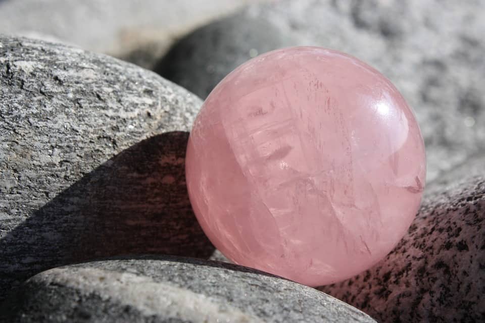
In a decision of epic color-of-the-year proportions, PANTONE has decided to choose the blending of two shades, Rose Quartz and Serenity, as the Color(s) of the Year for 2016.
The choice is meant to be soothing. The colors, when blended have a calming effect. They explain, “Rose Quartz and Serenity demonstrate an inherent balance between a warmer embracing rose tone and the cooler tranquil blue, reflecting connection and wellness as well as a soothing sense of order and peace.” Something we can all use a little more of these days, right?
I can’t help but be taken back to 1985 though, when dusty rose or soft mauve mini blinds were the latest and greatest in ‘80s home decor. I don’t miss that. Not one bit.
They say what goes around, comes around, and it’s quite apparent in most anything having to do with design. Nothing is really ever an original idea anymore, but it can be enhanced and updated—right? Let’s hope so.
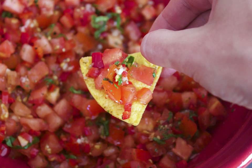
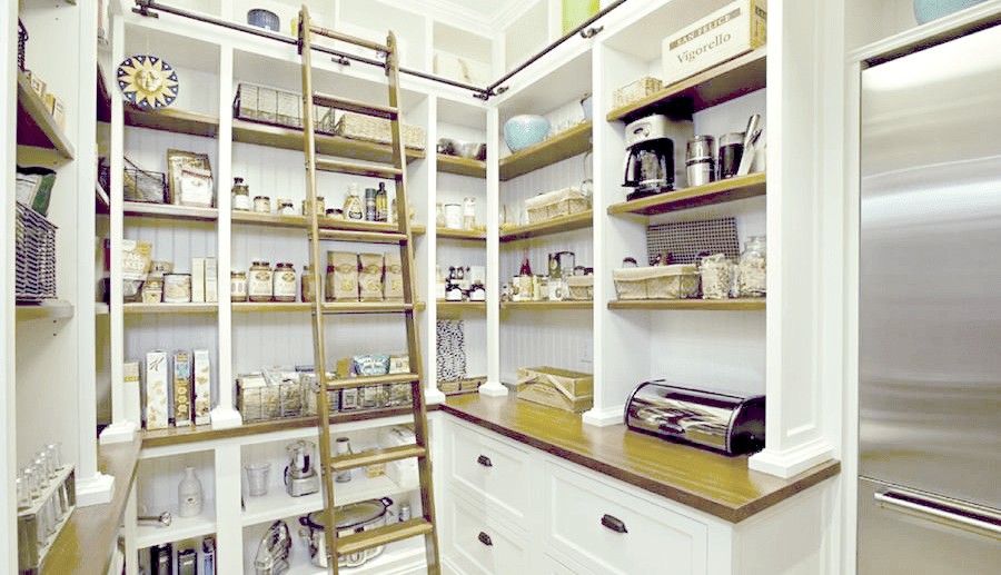
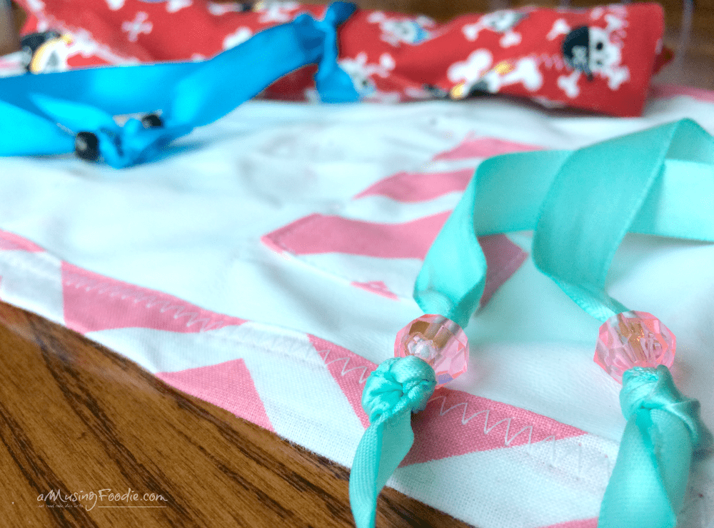
Here are a few modern ways you can incorporate PANTONE’s 2016 Color(s) of the Year, Rose Quartz and Serenity, into your kitchen and dining experience!
Disclosure: I’m compensated for putting together quarterly Ideabooks for Houzz, but the story, theme, and all the picks are my own!